ShopDreamUp AI ArtDreamUp
Deviation Actions


Description
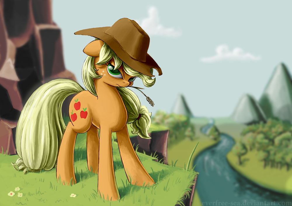
Applejack looking over Sweet Apple Acres.
Print made for the auction at the 5th Belgian Brony meet!
For you tumblr people out there, I'd appreciate if you didn't post this yourself but reblogged my post instead!
Print made for the auction at the 5th Belgian Brony meet!
For you tumblr people out there, I'd appreciate if you didn't post this yourself but reblogged my post instead!
Image size
1000x707px 534.2 KB
© 2013 - 2024 FiddleArts
Comments46
Join the community to add your comment. Already a deviant? Log In
Right off the bat I'm going to say that I love your piece (this is my favorite style), even if I sound over critical, which I likely will. I will also likely make observations that might contradict your specific intentions, so just keep in mind those will likely be just an opinion thing.
For example, to start off with an opinion thing, I noticed that the background (specifically the sky) was a little empty of color vibrancy and variety. What I mean by that is, in the sky, because of the consistent color, it seems that it is overcast even with clearly defined clouds in the sky. In addition, the sky seems to blend a little to well with the color scheme of the forest, making the whole background seem a bit bland. I am the kind of guy who loves contrast, and while Applejack adds a good bit, the background seems a bit washed out because of that lack of contrast between the sky and ground. Though I wouldn't count this as a big negative, but rather just an observation.
Regarding Applejack herself, something I noticed first off was that her tail, I think, was a little bit overdone in comparison to her mane. (Again, maybe just an opinion thing) I just think that it would make it flow better with respect to her mane and her character with a slightly thinner look, though not by much. I really like how you did her overall figure and face. It really shows a determined look in her face, almost like she's saying "don't mess with me". Just a small note, I think you made her hat a bit straight and angular rather than an arced form fitted hat. To me it makes it look like a firefighters hat, though it's not much more than a small note of mine.
I guess to wrap up this novel of a critique is with the small details. To start, I really liked how consistent you were with the lighting. I've noticed, a lot, that while artists have a great overall image with nicely made lighting, it's not consistent with where the source of light is. I noticed this first thing on your piece (even in the background with the trees). Though I have to note, I think you could have softened the change from light to shadow on Applejack (or at least on her front left foreleg and chest). I just think it's too hard of a transition in the front, considering that's the part of her that is most noticeable. And, as my last detail, I liked how you made her hair (all around) detailed using shadows without going into the fine details of the individual strands of hair. I think you accomplished this very efficiently without being to vague.
If you've finished reading this overcritical book, then I commend you for actually listening. It means you are really trying to improve, which, with a piece like this, is not much. I overall give this a 4.5/5 for detail and character expression. the only reason it's not a 5 is those two main things i mentioned regarding her tail and the sky. Again I really like this piece and encourage you to make more like it. <img src="e.deviantart.net/emoticons/s/s…" width="15" height="15" alt="
Now can somepony critique my critique so that I might not be so overcritical.