Journals8
Newest
My Other Deviantart
2 min read
Short version:
Find me here. Also on tumblr here.
Long version:
Heya everyone!
It's been a while since I've been active here and that's honestly mostly because I've completely lost interest in ponies. I originally made this account to separate fandom content from my main account, but I wound up using it exclusively for ponies.
Now since I have lost interest in ponies, I'm highly unlikely to draw any more of them, resulting in a continued lack of activity here. If you're still interested in seeing my art you can find it on my main deviantart account where I sporadically upload a bunch of mostly finished things I've drawn, or you could follow my tumblr which I update frequently!
And that kinda covers it I guess, but thank you all so so much for following me here in the first place and being interested in the art I've done. I hope to see some of you around on my other account, and to the rest of you I truly hope you can continue to enjoy your time in the pony fandom!
Join the community to add your comment. Already a deviant? Log In
I think I've decided who worst pony is.
5 min read
This journal may contain spoilers. You have been warned.
This is a journal with critique and an overdose of images. Might contain color & character design tips.
I love a pony with a great color scheme. One that fits the feel of the show and all that.
And I love a good background pony design when it comes around.
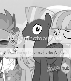
So, let's get straight to the point: THIS PONY.
They don't come any more alpha than this.
Snap out of it, Rainbow. Bronies will get the wrong idea.
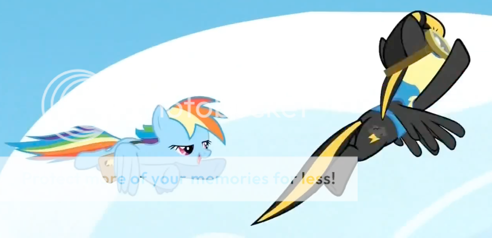
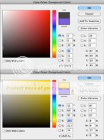
So first, let's have a look at Rainbow Dash' color scheme. Usually, I'd go for a "less is more" principle and restrict a character design to two or three colors, but I suppose the abundance of colors is part of Rainbow Dash' colorful personality. And rainbows and stuff.
Click to enlarge
This is Rainbow Dash's color scheme. Her mane is actually a bit more saturated than I initially thought, especially the blue. The reason for that is that the same blue is also used for her outline, which makes her pop out of the background. It makes her fit in instead of blend in. She'd be a part of the background if you took away her outline and overly colorful mane.
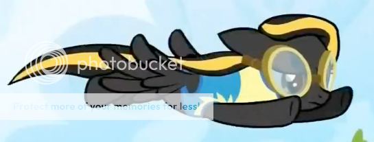
So why don't we have a look at Thundercloud's lovely color scheme now?
Again: click to enlarge
Well, for one, she sticks to the less is more principle, right? And the yellow seems perfectly fine, and her coat is...
Wait...

Black is the color of my soul.
I'd like you to go back to Rainbow Dash's color scheme, and look for even one reticule that was even close to being as low on this color chart as Thundercloud's coat color is. Try it. Please, try it?
So what, just because her coat is so dark doesn't make it a bad design, right? Even if black-and-yellow is a ridiculously cliché color scheme.
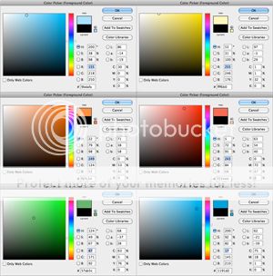
You're completely right, which is why we'll handle another very important subject in character design. Perhaps even more important than colors: contrast.
No comment.
I think the image above actually does all the talking, but I'll make you read some more text either way.
On her own, her design still isn't that bad. Her eyes would pop out great, the uniform does her good and the streak accentuates her mane and tail.
But for a Friendship is Magic design? Terrible. I'm sorry, it just is.
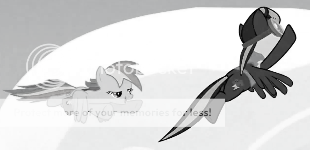
As shown in the image, Rainbow Dash has relatively low contrast in her design. Her mane is, overall, darker than her coat, which goes for most pony designs. She's not too bright and definitely not too dark and, as I said earlier, she fits in.
Now, Thundercloud. She definitely does not fit in. She's like an oil stain on a very clean, bright handkerchief. A handkerchief you loved. It literally looks as if she was pasted onto the image at a later time, instead of made with the background in mind. She's in too rough contrast with the background, making her somewhat of an eyesore and unbalancing the shot.
(If you're not sure what I mean by unbalancing: imagine placing a weighing scale in the middle of the image. The right side seems heavier. Artists often balance this out by placing contra-weight on the other side of the image. It's true, look it up.)
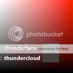
"But what about Thunderlane?"
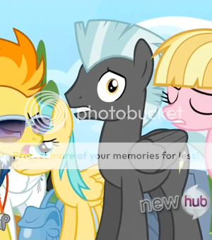
What about me?
Oh boy, and here I thought this journal was already too long. Let's go over the basic things we've learned, and decide wether or not I should hate Thunderlane.
So firstly, the color scheme. Thunderlane's mane has a light, minty color, with a brighter variant for accent and variation. His coat is still very dark, though. The greyscale version show how dark.
I'm not ready for critique.
Remember what I said about Thundercloud being an oil stain on a perfect handkerchief? Thunderlane isn't like that. While he might still be too dark for the show's feel, he somehow manages to.. Almost fit in. Close enough, I'd say.
I'm just going to cut it short here (short, hah!). Leave a comment if you have anything to say ("You have no life! Boo!" as a fine example), I'd appreciate it!
... Also, there was way too much Pinkie Pie for a Rainbow Dash episode.
This is a journal with critique and an overdose of images. Might contain color & character design tips.
I love a pony with a great color scheme. One that fits the feel of the show and all that.
And I love a good background pony design when it comes around.
So, let's get straight to the point: THIS PONY.
They don't come any more alpha than this.
THIS PONY (can I call her Thundercloud?) does not have "a good background pony design". She looks like a generic, poorly designed OC.
Her mane was black as the night with a streak of actual lightning in her mane. She was best friends with rainbow dash and was also the seventh element of Harmony: darkness, to represent the darkness in us all. She defeated Discord one thousand years ago and also chrysalis and sombra too and helped Celestia do the dishes last night.
You probably get my point.
Now if you're wondering what all this fuss is about, I'll go over some basic color stuff, using this image.
Snap out of it, Rainbow. Bronies will get the wrong idea.
So first, let's have a look at Rainbow Dash' color scheme. Usually, I'd go for a "less is more" principle and restrict a character design to two or three colors, but I suppose the abundance of colors is part of Rainbow Dash' colorful personality. And rainbows and stuff.

Click to enlarge
This is Rainbow Dash's color scheme. Her mane is actually a bit more saturated than I initially thought, especially the blue. The reason for that is that the same blue is also used for her outline, which makes her pop out of the background. It makes her fit in instead of blend in. She'd be a part of the background if you took away her outline and overly colorful mane.
So why don't we have a look at Thundercloud's lovely color scheme now?

Again: click to enlarge
Well, for one, she sticks to the less is more principle, right? And the yellow seems perfectly fine, and her coat is...
Wait...
Black is the color of my soul.
I'd like you to go back to Rainbow Dash's color scheme, and look for even one reticule that was even close to being as low on this color chart as Thundercloud's coat color is. Try it. Please, try it?
So what, just because her coat is so dark doesn't make it a bad design, right? Even if black-and-yellow is a ridiculously cliché color scheme.
You're completely right, which is why we'll handle another very important subject in character design. Perhaps even more important than colors: contrast.
No comment.
I think the image above actually does all the talking, but I'll make you read some more text either way.
On her own, her design still isn't that bad. Her eyes would pop out great, the uniform does her good and the streak accentuates her mane and tail.
But for a Friendship is Magic design? Terrible. I'm sorry, it just is.
As shown in the image, Rainbow Dash has relatively low contrast in her design. Her mane is, overall, darker than her coat, which goes for most pony designs. She's not too bright and definitely not too dark and, as I said earlier, she fits in.
Now, Thundercloud. She definitely does not fit in. She's like an oil stain on a very clean, bright handkerchief. A handkerchief you loved. It literally looks as if she was pasted onto the image at a later time, instead of made with the background in mind. She's in too rough contrast with the background, making her somewhat of an eyesore and unbalancing the shot.
(If you're not sure what I mean by unbalancing: imagine placing a weighing scale in the middle of the image. The right side seems heavier. Artists often balance this out by placing contra-weight on the other side of the image. It's true, look it up.)
"But what about Thunderlane?"
What about me?
Oh boy, and here I thought this journal was already too long. Let's go over the basic things we've learned, and decide wether or not I should hate Thunderlane.
So firstly, the color scheme. Thunderlane's mane has a light, minty color, with a brighter variant for accent and variation. His coat is still very dark, though. The greyscale version show how dark.
I'm not ready for critique.
Remember what I said about Thundercloud being an oil stain on a perfect handkerchief? Thunderlane isn't like that. While he might still be too dark for the show's feel, he somehow manages to.. Almost fit in. Close enough, I'd say.
I'm just going to cut it short here (short, hah!). Leave a comment if you have anything to say ("You have no life! Boo!" as a fine example), I'd appreciate it!
... Also, there was way too much Pinkie Pie for a Rainbow Dash episode.
Join the community to add your comment. Already a deviant? Log In
Can't win'm all, I guess?
2 min read
First of all, I would very much like to thank everyone who voted for me. When the votes were counted, I was behind a mere 3 votes!
I went and bought myself a premium membership before the 2x1 offer expired anyway, not sure if I'll feel guilty about this or not tomorrow. Probably will.
I entered another competition*, and while I'm currently in first place, it looks like that's going to end soon.
RayLionHeart's submission caught up with me in less than 2 hours, and the voting deadline's in a few hours!
The prize is 2 years' worth of Deviantart Premium membership, something I'd really want (and I promise I won't spam you guys with polls if I do get it).
As little gift for my voters, I'll draw a follow-up of the piece above if I win. So if you want to see what happened after the fall, please vote!
* In my defense, it stimulates productivity.</sub>
I went and bought myself a premium membership before the 2x1 offer expired anyway, not sure if I'll feel guilty about this or not tomorrow. Probably will.
RayLionHeart's submission caught up with me in less than 2 hours, and the voting deadline's in a few hours!

The prize is 2 years' worth of Deviantart Premium membership, something I'd really want (and I promise I won't spam you guys with polls if I do get it).
As little gift for my voters, I'll draw a follow-up of the piece above if I win. So if you want to see what happened after the fall, please vote!
* In my defense, it stimulates productivity.</sub>
Join the community to add your comment. Already a deviant? Log In
Thank you, everyone!
2 min read
When I first saw the results of the poll I doubted I'd win (considering I was in, like, 5th place at the moment, with 7 votes against first place's 15), but your votes lifted my entry up to the first spot in no time at all. With more than 20 votes ahead of second place, can't tell you how amazed I was.
I know this sounds so corny, but if it wasn't for you guys I wouldn't have won. So thank you, several billion times.
I guess I should draw something special to mark the occasion. Stay tuned. Love you. <3
I know reading journals is boring, so I'll keep this short:
I entered Equestria-Daily's Nightmare Night competition, and you can vote on it here.
This is my entry.

And in case you missed it, voting can be done here.
I would very much appreciate your vote <3 Thanks in advance!
(I am currently losing ._. I'd need a lot of votes to get to first place from where I am now)
I know this sounds so corny, but if it wasn't for you guys I wouldn't have won. So thank you, several billion times.
I guess I should draw something special to mark the occasion. Stay tuned. Love you. <3
I entered Equestria-Daily's Nightmare Night competition, and you can vote on it here.
This is my entry.
And in case you missed it, voting can be done here.
I would very much appreciate your vote <3 Thanks in advance!
(I am currently losing ._. I'd need a lot of votes to get to first place from where I am now)
Join the community to add your comment. Already a deviant? Log In
About Tumblr and sketches!
2 min read
Ohai my dearest watchers! <3
(there's a whopping 167 of you now, I feel so damn proud!)
As a handful of you already know - I have a tumblr.
And as some more of you may know, I do (free!) sketch requests.
Thing is - I'm moving these sketches to my Tumblr.
Why is this important enough to make a journal about you ask?
Well because I'd like to explain some basic things and stuffs.
Firstly - you can still request sketches through the original journal. What's new is that you can now also request sketches through my tumblr!
Secondly - I will not be posting any notice regarding those sketches here on deviantart. They dissapear from the queue and reappear in their sketchy shape on my tumblr.
To give you a taste, here are some sketches that I've posted exclusively on my tumblr.
Discord's victory over Twilight WIP
Rarisalis and Pinkord WIP
Powerpuff Ponies and professor!
Derpy Hooves and Dinky [Warning: cuteness overload]
My tumblr will not be used exclusively for sketches, however. WIPs and final results will also be posted there.
Thank you for reading, and please reconsider following me on tumblr!
(honestly, people posting my drawings on tumblr get more likes and reblogs out of them than I do, it's not fair :<)
Join the community to add your comment. Already a deviant? Log In